Background
Zapf, Hermann was born on November 8, 1918 in Nuremberg, Germany. Son of Hermann and Magdalene (Schlamp) Zapf.

(First edition, limited to 1000 copies signed by Zapf and ...)
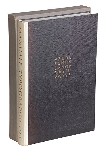
First edition, limited to 1000 copies signed by Zapf and printed by Heinrich Egenolf at Stempel's printing house with types owned by Stempel. Introductory matter in English. A landmark in the study of type and design. 100 comments on typography by the great names in the field arranged on the page by Zapf in various typographic displays and printed in red and black. Presentation from Zapf on front free endpaper to Bill Steone dated 1955. Parchment spine is age darkened. iv preliminary pages followed by 100 leaves with an embossed page number, 4 pages. publisher's parchment-backed cloth with "MT" in gilt on front cover, later pastepaper-covered slipcase.. oblong 8vo..
http://www.amazon.com/gp/product/B00KM5MHG8/?tag=2022091-20
(Limited to 2000 copies. Printed by D. Stempel on Italian ...)
Limited to 2000 copies. Printed by D. Stempel on Italian Fabriano paper. A landmark in the history of calligraphy. Small mark on front cover. Back cover has scratches. Name in ink in corner of free endpaper. Page 18 has tear. Not paginated. parchment-backed boards.. oblong 4to..
http://www.amazon.com/gp/product/B0091X76BS/?tag=2022091-20
http://www.amazon.com/gp/product/0941447006/?tag=2022091-20
("Type is the tie or ligature between author and reader," ...)
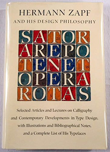
"Type is the tie or ligature between author and reader," writes Hermann Zapf, "and it is much to be desired that readers become more critical and gradually more sensitive about the choice of type in a book. In this connection the question arises whether our modern book production shows generally that unity of content and form common, for example, among the books of the 15th and 16th and even later centuries. Why is this unity generally lost? And is it not an anachronism when Albert Einstein's relativity theory, or works by Bertrand Russell, Pasternak and other such are printed with types of historic design?...Books of historical content, books that seek to produce a certain mood or atmosphere in the reader, such books may continue to be set in historical or classical types—I do this myself in my own typographic works. On the other hand there are available so many devices expressive of our time that we ought not to banish them when we design books for our time." The designing of typographic devices and books "for our time" has been Hermann Zapf's central commitment as an artist. In this book he displays his art—he designed the book, which is set in a typeface of his own devising, Linotype Optima. The book is illustrated with type specimens from other fonts he has designed, and the text is both an autobiographical account of his artistic development and a statement of principles. First published in 1960 in a limited, numbered edition by The Typophiles, the book is now presented in a revised edition for the growing number of readers, printers, and designers who have become sensitive and sophisticated in matters of type. They will particularly be able to appreciate the author's versatility of form and graphic statement as reflected in the type styles illustrated here, including such famous faces as Palatino, Melior, Saphir, Aldus, and Optima. Other faces are also illustrated, some embodying Greek, Cyrillic, and Arabic characters. There are in addition some double-page working drawings showing changes and alterations in the author's hand and several specimen page layouts.
http://www.amazon.com/gp/product/0262740036/?tag=2022091-20
(Limited to only 99 sets of which 75 were for sale. Number...)
Limited to only 99 sets of which 75 were for sale. Numbered and signed by both Metzger and Zapf. The broadsides are printed in a variety of typefaces and on different papers. A very scarce example of the best of American private press work. Cardboard mailing box is toned. Book is as new condition. With spine label for box and printed note on how to care for plastic case loosely inserted. 27 loose broadsides measuring 9 x 12 inches inserted in a special plastic box which is inserted in a cardboard mailing box with a printed paper label.. 4to..
http://www.amazon.com/gp/product/B00L1FL4J4/?tag=2022091-20
(One hundred typographic pages are exhibited in this book,...)
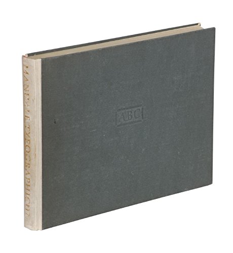
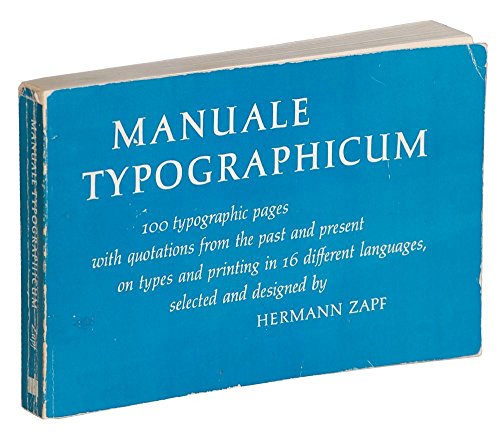
One hundred typographic pages are exhibited in this book, consisting of alphabets and quotations printed in various type styles. The quotations selected by the author concern types and printing, are from the past and the present, and are in 16 languages (translations are provided). Hermann Zapf is a noted type designer and he himself originally devised many of the type faces used here. Other faces were taken from the fonts of the Stempel foundry in Frankfurt/Main and historic faces came from that foundry's archives. The author has also designed the page layouts, choosing for this manual a horizontal format. The purpose of the manual is "to show the myriad possibilities of the expressiveness and beauty of type, whether individually or in massed text, by the use of purely typographic means." The original English edition of this work was limited to 1000 copies. In making it available to a larger audience, Paul Standard's comment, printed in the original, becomes more pertinent still: "In a world grown noisy and clamorous, reading remains among the very few quiet pleasures left to man. The present work hopes to be considered an attempt to bring a body of critical and expository comment to the widest circle of readers—comment upon every contributory element in bookmaking and printing generally, upon the design of letter forms and their disposition on the page. The very sight of so many different languages on these successive pages is itself a humanizing experience, suggesting as it does a striving for unity while preserving linguistic diversity by means of the printer's art." This "critical and expository comment" has been culled from a wide international range of writers, including both masters of literature and masters of the art of printing.
http://www.amazon.com/gp/product/0262740044/?tag=2022091-20
(Limited to 99 copies of which 60 were for sale. Zapf desi...)
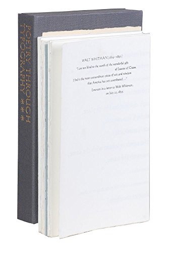
Limited to 99 copies of which 60 were for sale. Zapf designed the layout and typography for a series of poems and then asked a prominent printer to print the poem. Included is the work of Martino Mardersteig 2 sections , Jerry Kelly 5 sections , Sebastian Carter, Klaus Hoffmann, Ludwig Oehms, Walter Hamady, and Jim Yarnell 2 sections . clamshell box containing 13 sheets printed on both sides and folded into four sections and a printed title sheet.. 8vo..
http://www.amazon.com/gp/product/B00U0IZJA8/?tag=2022091-20
("Type is the tie or ligature between author and reader," ...)
"Type is the tie or ligature between author and reader," writes Hermann Zapf, "and it is much to be desired that readers become more critical and gradually more sensitive about the choice of type in a book. In this connection the question arises whether our modern book production shows generally that unity of content and form common, for example, among the books of the 15th and 16th and even later centuries. Why is this unity generally lost? And is it not an anachronism when Albert Einstein's relativity theory, or works by Bertrand Russell, Pasternak and other such are printed with types of historic design?...Books of historical content, books that seek to produce a certain mood or atmosphere in the reader, such books may continue to be set in historical or classical types—I do this myself in my own typographic works. On the other hand there are available so many devices expressive of our time that we ought not to banish them when we design books for our time." The designing of typographic devices and books "for our time" has been Hermann Zapf's central commitment as an artist. In this book he displays his art—he designed the book, which is set in a typeface of his own devising, Linotype Optima. The book is illustrated with type specimens from other fonts he has designed, and the text is both an autobiographical account of his artistic development and a statement of principles. First published in 1960 in a limited, numbered edition by The Typophiles, the book is now presented in a revised edition for the growing number of readers, printers, and designers who have become sensitive and sophisticated in matters of type. They will particularly be able to appreciate the author's versatility of form and graphic statement as reflected in the type styles illustrated here, including such famous faces as Palatino, Melior, Saphir, Aldus, and Optima. Other faces are also illustrated, some embodying Greek, Cyrillic, and Arabic characters. There are in addition some double-page working drawings showing changes and alterations in the author's hand and several specimen page layouts.
http://www.amazon.com/gp/product/B0007E2MUU/?tag=2022091-20
(Oblong (9 X 12 in.) hardcover, with vellum spine & short ...)
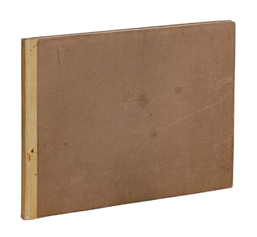
Oblong (9 X 12 in.) hardcover, with vellum spine & short wraparound over brown paper boards, and emblem stamped on the front board. Contains 25 plates of various typefaces, in black, and black & red-brown. Appendix titled, "The Historical Development of Occidental Letterforms." This American edition of Zapf's 1949 "Feder und Stichel," was limited to 2000 copies, and printed on Italian Fabriano paper.
http://www.amazon.com/gp/product/B000JLW5FI/?tag=2022091-20
(In German. Limited to 800 numbered copies and signed by Z...)
In German. Limited to 800 numbered copies and signed by Zapf. Contains material developed after the 1954 version. A landmark in the study of type and design. Printed in black and red. With text in 18 different languagues including English. vi pages followed by 117 leaves, each with an embossed page number. parchment-backed cloth, slipcase.. 4to..
http://www.amazon.com/gp/product/B0017WSG4W/?tag=2022091-20
(Reprint edition. With prefaces written by Paul Standard,...)
Reprint edition. With prefaces written by Paul Standard, New York, G.K. Schauer, Frankfurt and Charles Peignot, Paris. The prefaces are in the languages of the authors English, German and French. The typographical examples are in the original languages of the selected books.
http://www.amazon.com/gp/product/0918142008/?tag=2022091-20
Zapf, Hermann was born on November 8, 1918 in Nuremberg, Germany. Son of Hermann and Magdalene (Schlamp) Zapf.
Doctor in Fine Arts (honorary), University Illinois, 2003.
Freelance designer, since 1938. Type director D. Stempel AG, type foundry, Frankfurt, Federal Republic of Germany, 1947-1956. Design consultant Mergenthaler Linotype Company (New York City and Frankfurt), 1957-1974.
Consultant Hallmark International, Kansas City, Missouri, 1966-1973. Vice president Design Processing International Incorporated, New York York City, 1977—1987. Professor typographic computer programs Rochester (New York ) Institute of Technology, 1977-1987.
Chairman Zapf, Burns & Company, New York City, 1987-1991. Instructor lettering Werkkunstschule, Offenbach, Federal Republic Germany., 1948-1950. Professor graphic design Carnegie Institute of Technology, 1960.
Instructor typography Technische Hochschule, Darmstadt, Federal Republic Germany, 1972-1981.
("Type is the tie or ligature between author and reader," ...)
("Type is the tie or ligature between author and reader," ...)
(First edition, limited to 1000 copies signed by Zapf and ...)
(One hundred typographic pages are exhibited in this book,...)
(Limited to 110 copies of which this is one of the 75 regu...)
(Limited to only 99 sets of which 75 were for sale. Number...)
(Limited to 99 copies of which 60 were for sale. Zapf desi...)
(Limited to 2000 copies. Printed by D. Stempel on Italian ...)
(Oblong (9 X 12 in.) hardcover, with vellum spine & short ...)
(Reprint edition. With prefaces written by Paul Standard,...)
(In German. Limited to 800 numbered copies and signed by Z...)
Honorary president Edward Johnston Foundation, Ditchling, England. Member of International Gutenberg Gesellschaft, Bund Deutscher Grafik Designer, Alliance Graphique International, American Mathematics Society, Royal Society Arts, Dante e.V. (German TEX Group) (honorary), Society Scribes New York (honorary), Brno Biennale Association (honorary), Goudy International Center (honorary), Alcuin Society of Canada (honorary), Typographers International Association (honorary), Chicago Calligraphy Collective (honorary), Eesti Kalligraafide Koondis (honorary. Tallinn, Estonia), Wynkyn de Worde Society (honorary), Society Calligraphy (honorary), Grafiska Institute (honorary), Bund Deutscher Buchkünstler (honorary), Society Graphic Designers Canada (honorary), Society Printers (honorary), Society Typographic Arts (honorary), Society Typographique de France (honorary), Associates of Stanford University Libraries, Art Directors Club Kansas City (honorary), Alpha Beta Club (honorary.
Hong Kong), Friends of Calligraphy (honorary), Double Crown Club (honorary), Type Directors Club New York City (honorary), Society Scribes and Illuminators (honorary), Typophiles (honorary), Letter Exchange (honorary), Washington Calligrapher's Guild (honorary), Monterey Calligrapher's Guild (honorary), Caxton Club (honorary), Gamma Epsilon Tau (honorary).
Married Gundrun von Hesse, August 18,1951. 1 child, Christian Ludwig.